Sometimes you’re sharing sheets with stakeholders, clients or just some VIP – it’s good to make it look good. Here’s 5 tips on how to make your Google Sheets look better and more professional.
Tip 1: Avoid the default font. Google Sheets gives you access to all Google Fonts. Pick one which resonates with your brand identity. Arial no more!
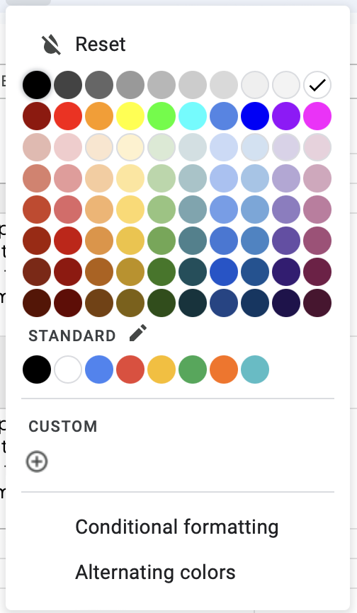
Tip 2: Dull down your colours. Bright colours are sore to look at, distracting and not needed. Work your way down the colour chart to find softer versions of the bright reds, oranges, yellows and greens you’ve been using.
Avoid the brightest colours
Tip 3: Give yourself space to breath. Make your cells wider [content depending] and use the alignment tools to your benefit. The key to making something look more corporate is to make sure there’s enough white space.
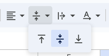
Tip 4: Give yourself space to breath. Make your cells wider [content depending] and use the alignment tools to your benefit. The key to making something look more corporate is to make sure there’s enough white space. Use the vertical alignment, drag your cells wider or taller, and ensure your body text is reading well. Avoid central aligned paragraphs.
Vertical Alignment
And there you go! Making your sheet look goood. An easy way to make it a little bit fancy without extensions, freelancers or software.
Tip 5: Create subtle borders to make content stand out. While you should avoid adding thick, black borders around every cell, adding a subtle light grey border around a table can help make it stand out.